The Skep - Identity, Wayfinding + Print Design
Brand Identity, Wayfinding, Print, Environmental Graphics - 2025
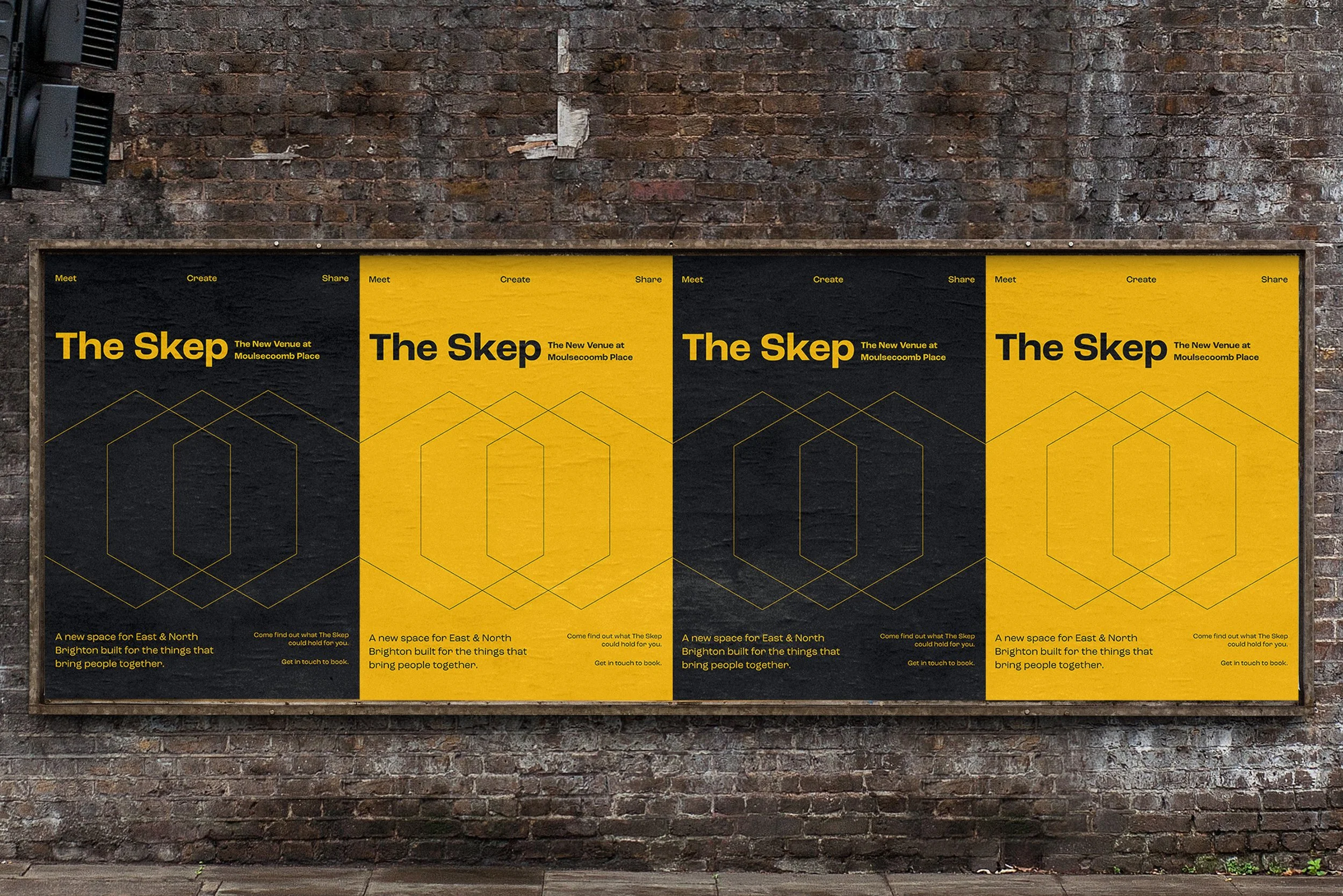
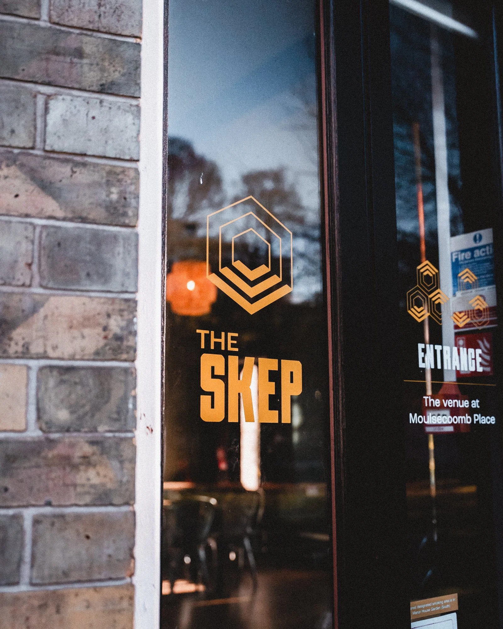
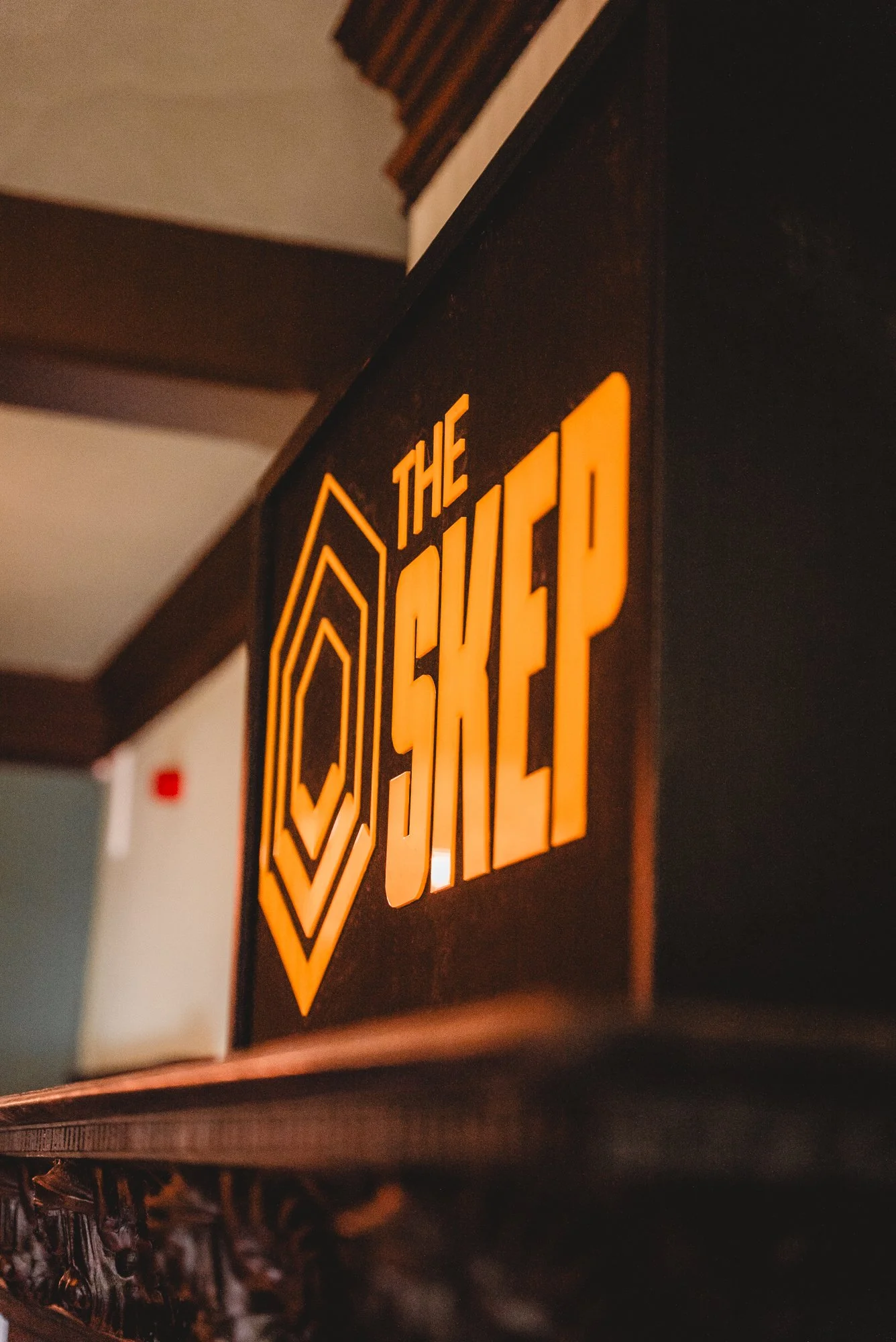
Identity and wayfinding for The Skep, a new community venue in east Brighton.
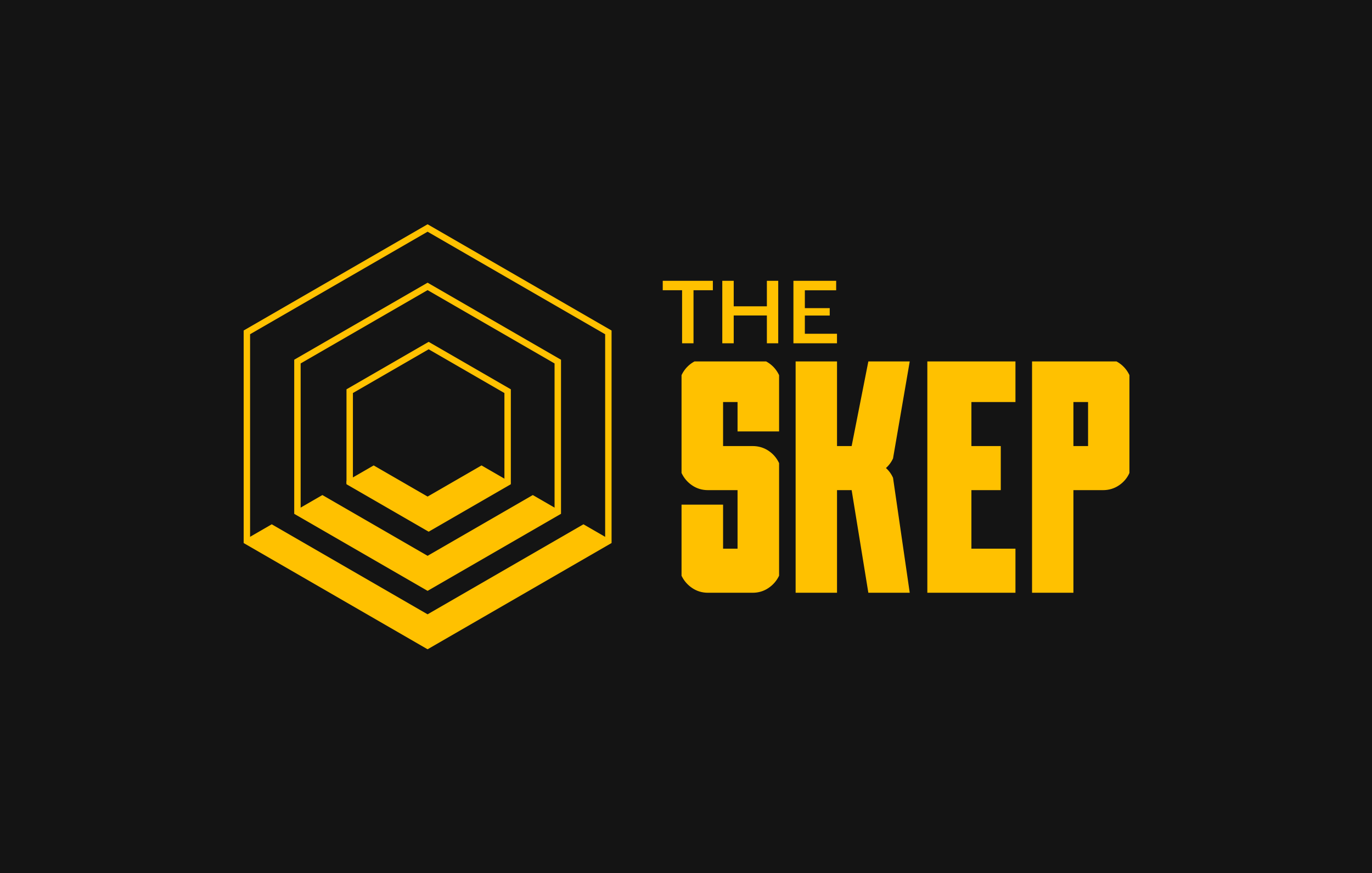
The name comes from a traditional woven beehive - a shelter for collective activity. That idea shaped everything. The hexagonal mark works as both symbol and wayfinding device, with layered forms for the different communities the space supports. The system scales across vinyl, glazing, signage and print - strong enough to hold the physical space together, flexible enough to adapt as the venue grows.