Occlusion - Typographic Poster Series
Conceptual Project
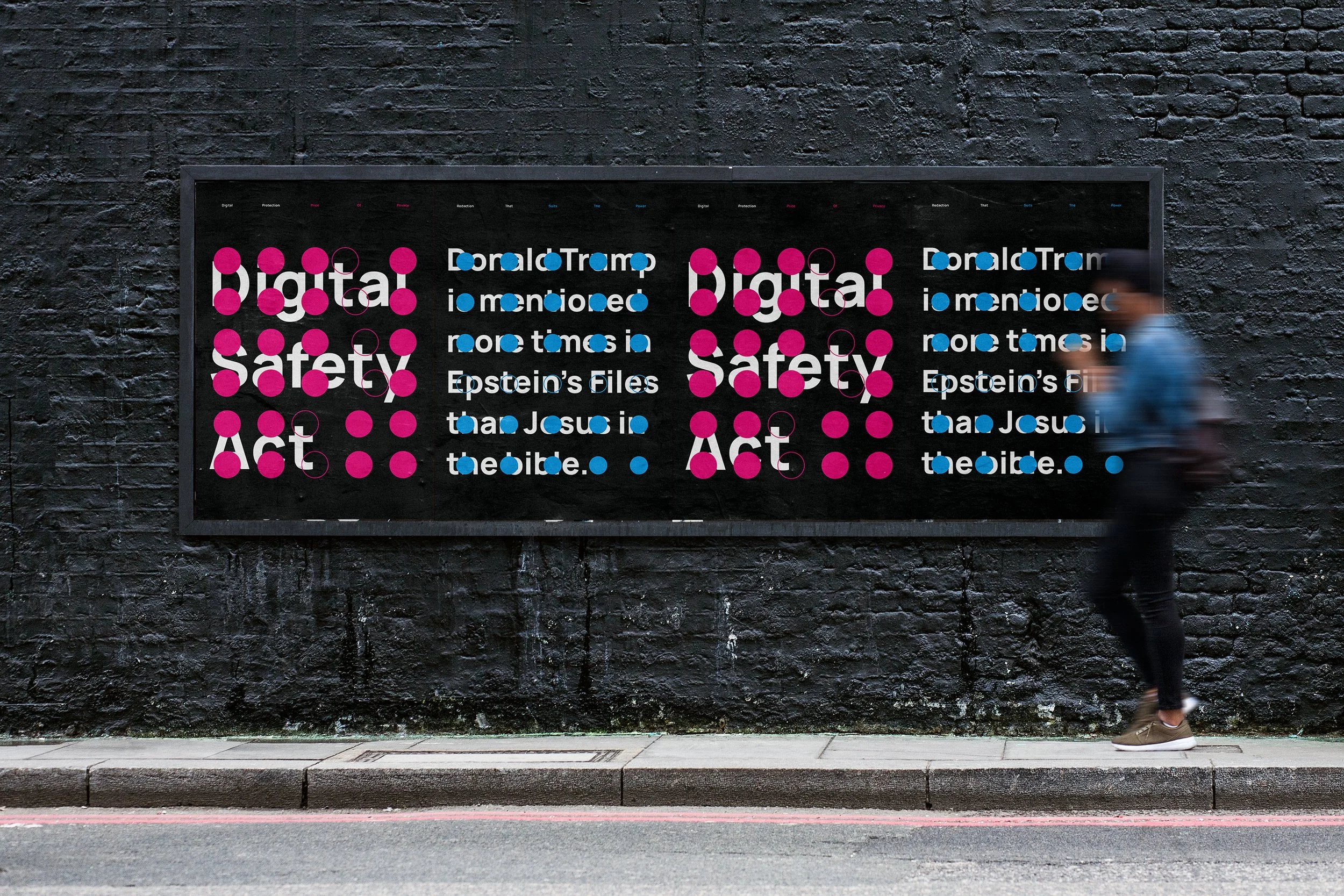
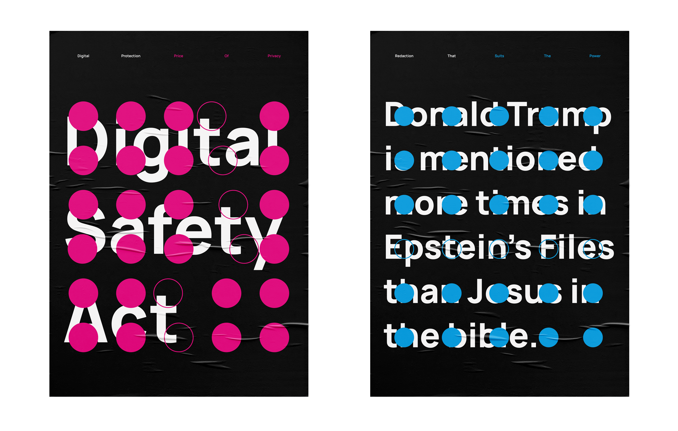
Two posters built from the same system - circles on a grid - each addressing a different instance of information being obscured.
The first responds to the UK's Digital Safety Act. Solid circles sit across a grid, burying the legislation's name beneath them. The density is deliberate - the thing designed to protect you is visually smothered by the structure it governs. Hollow circles break the grid's uniformity to track the letter T through each word - a nod to the surveillance and tracking the Act itself enables, while also creating a secondary reading system that asks the viewer to scan and decode rather than just read. The top line uses colour to separate institutional language from editorial - white for the procedural, magenta for the critical.
The second addresses selective redaction in the Epstein files. Blue circles sit over the text like redaction marks - consistent, clinical, evenly placed. But the text stays legible underneath. The concealment is as visible as the content itself, and that's the point; the irony of obvious redaction. Does hiding the obvious make it more evident?
Tools built for clarity become tools of obstruction. The circle does something different in each poster, but the question is shared - what happens when structures meant to organise information are used to control it.
The series is designed to expand, with each new piece applying the same formal language to a different subject.