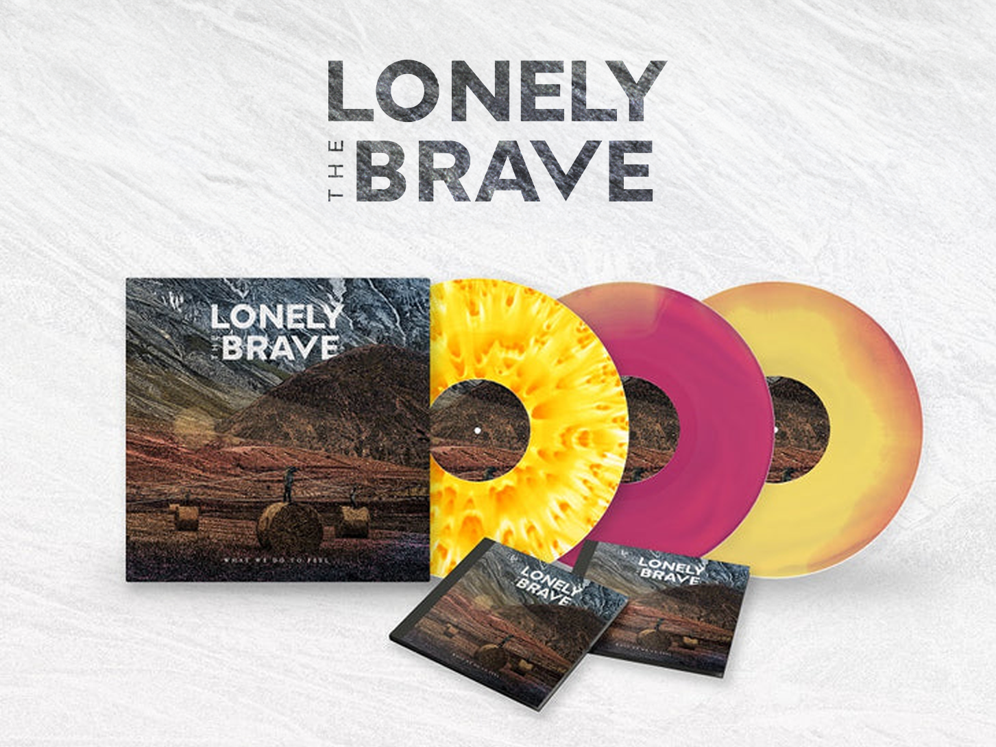
Lonely The Brave - Identity Work
Role: Logo Design, Identity Refinement, Typography, Art Direction
This project was an evolution of Lonely The Brave’s existing logo, focused on refinement rather than reinvention.
The redesign focused on the typography, retaining the band’s trademark downwards arrow, but moving it into the word-mark itself and using it to disrupt the logo in the form of a sharpened ‘V’ sitting amongst more blunted letterforms, pushing the mark towards a bolder, more mature expression. Simplification improved clarity, consistency and versatility across album artwork, merchandise and tour materials, while moving the band away from the softer visual language of earlier releases to better reflect their newer sound.
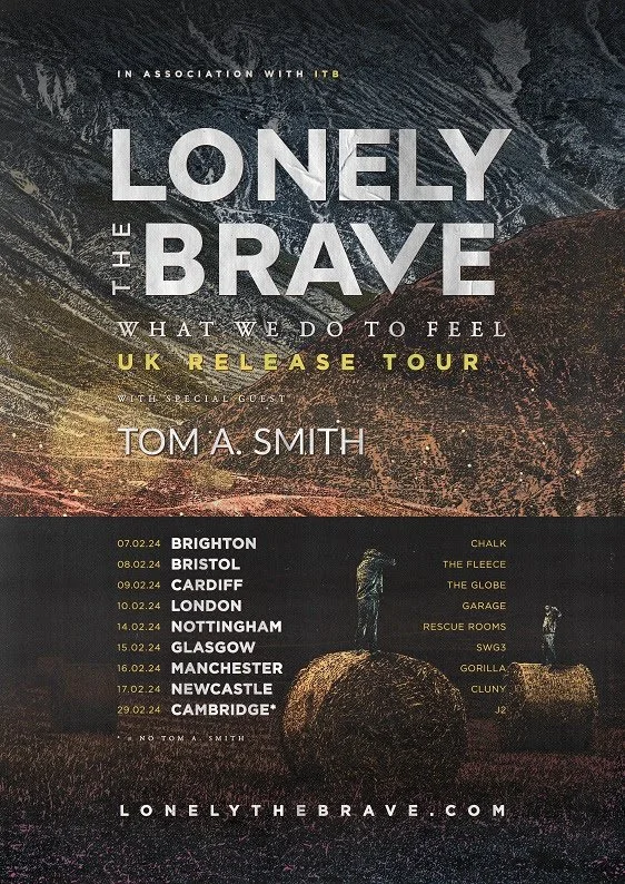
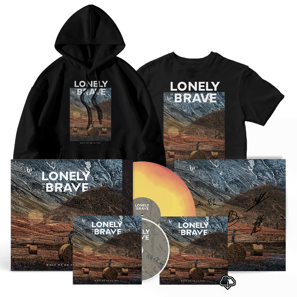
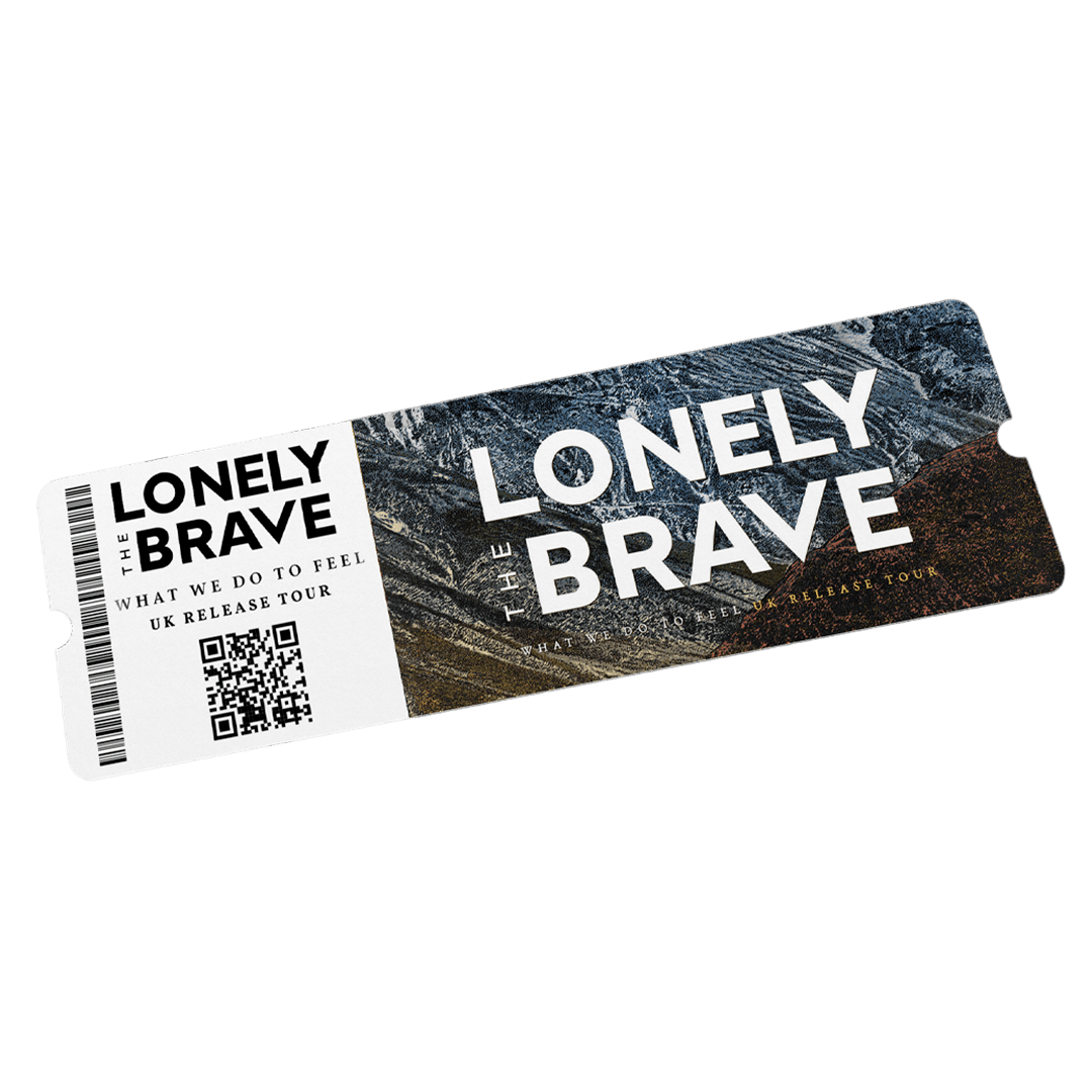
The updated logo became the band’s primary visual identity and was used across their latest major releases and formats.