Heard but not Seen
Self-Initiated - 2025
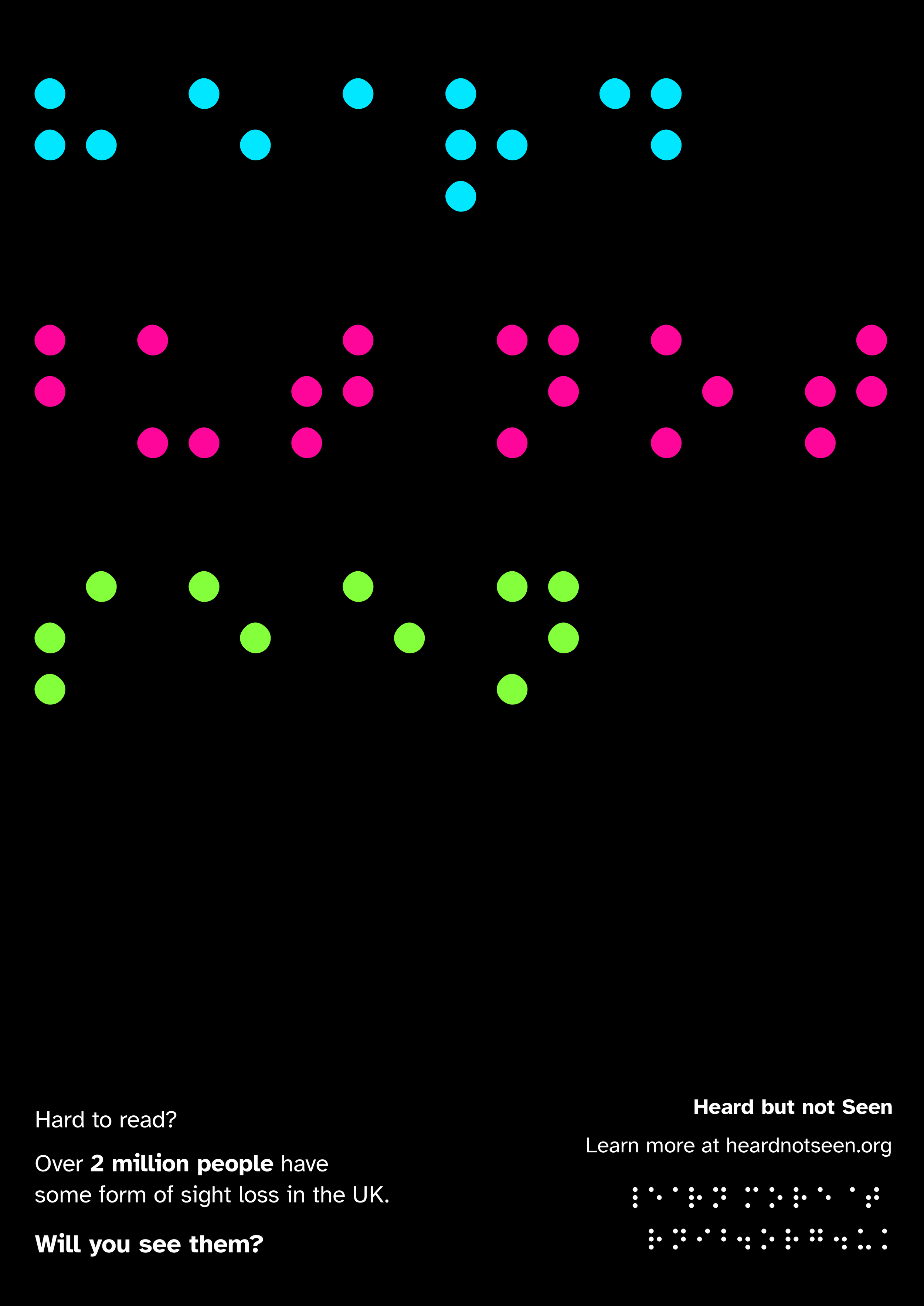
A conceptual campaign about sight loss in the UK. The title flips the familiar phrase - over 2 million people navigate systems designed primarily for the sighted.
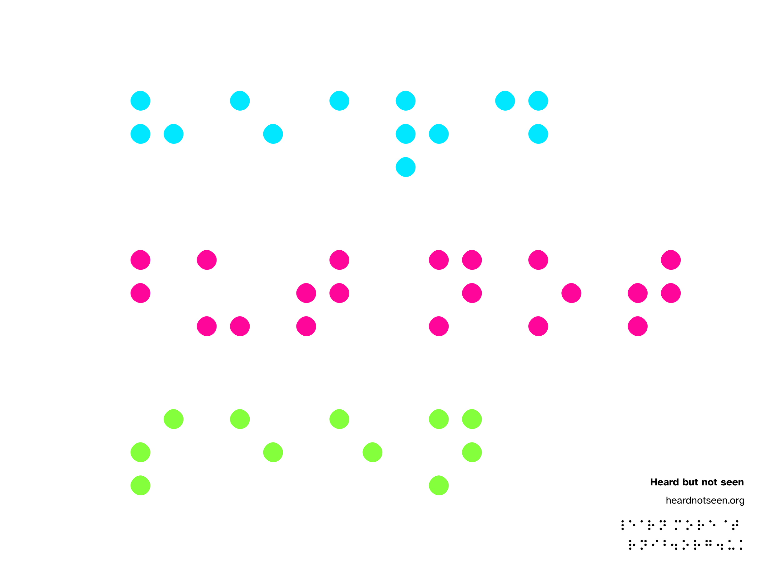
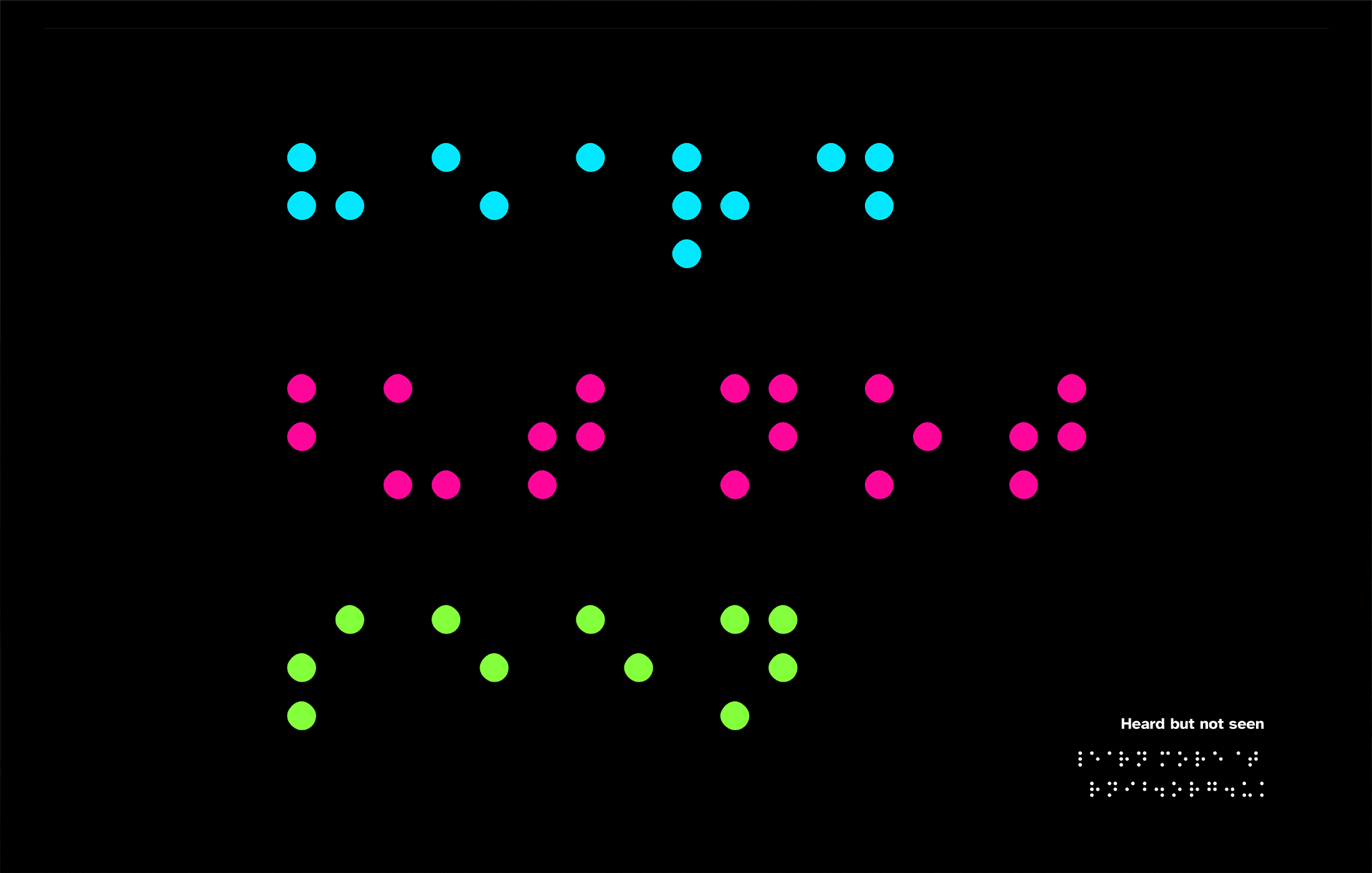
The campaign uses Atkinson Hyperlegible, a typeface built for low-vision legibility, then deliberately disrupts it. Braille is treated as primary content - elevated in scale and colour rather than tucked away as annotation. The viewer has to slow down and work harder to read the message. That friction mirrors the experience it's about.
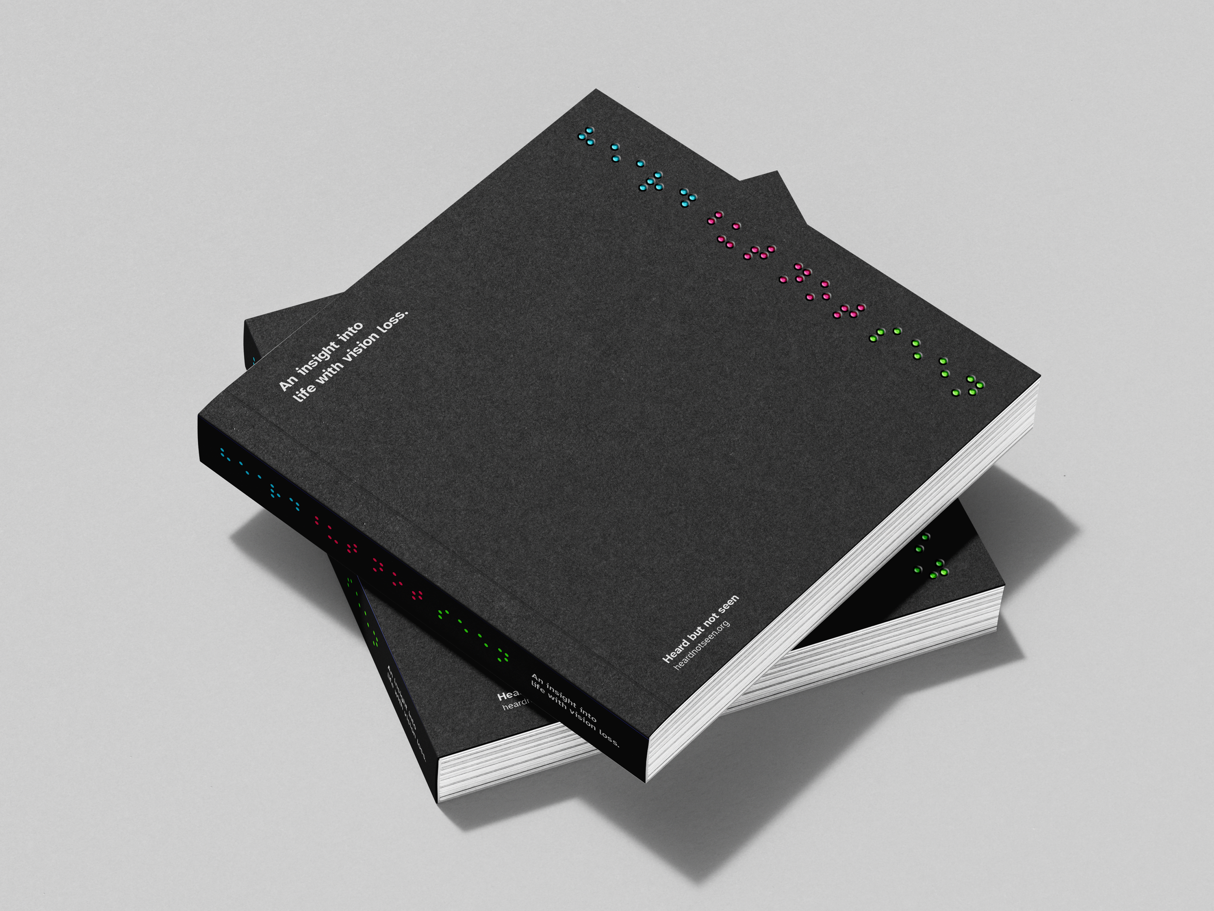
Real world book application, demonstrating embossed braille

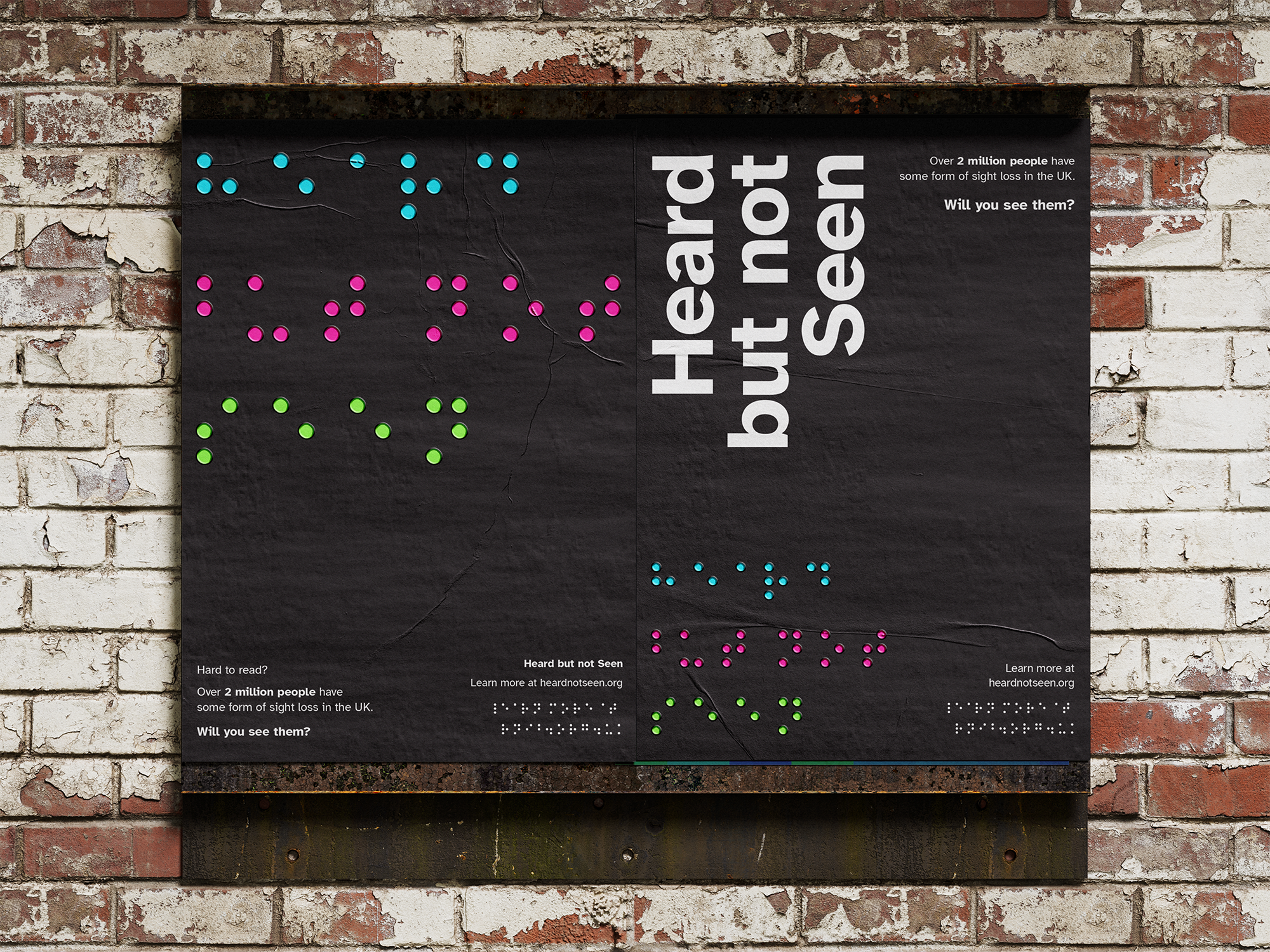
Real world poster application, demonstrating embossed braille