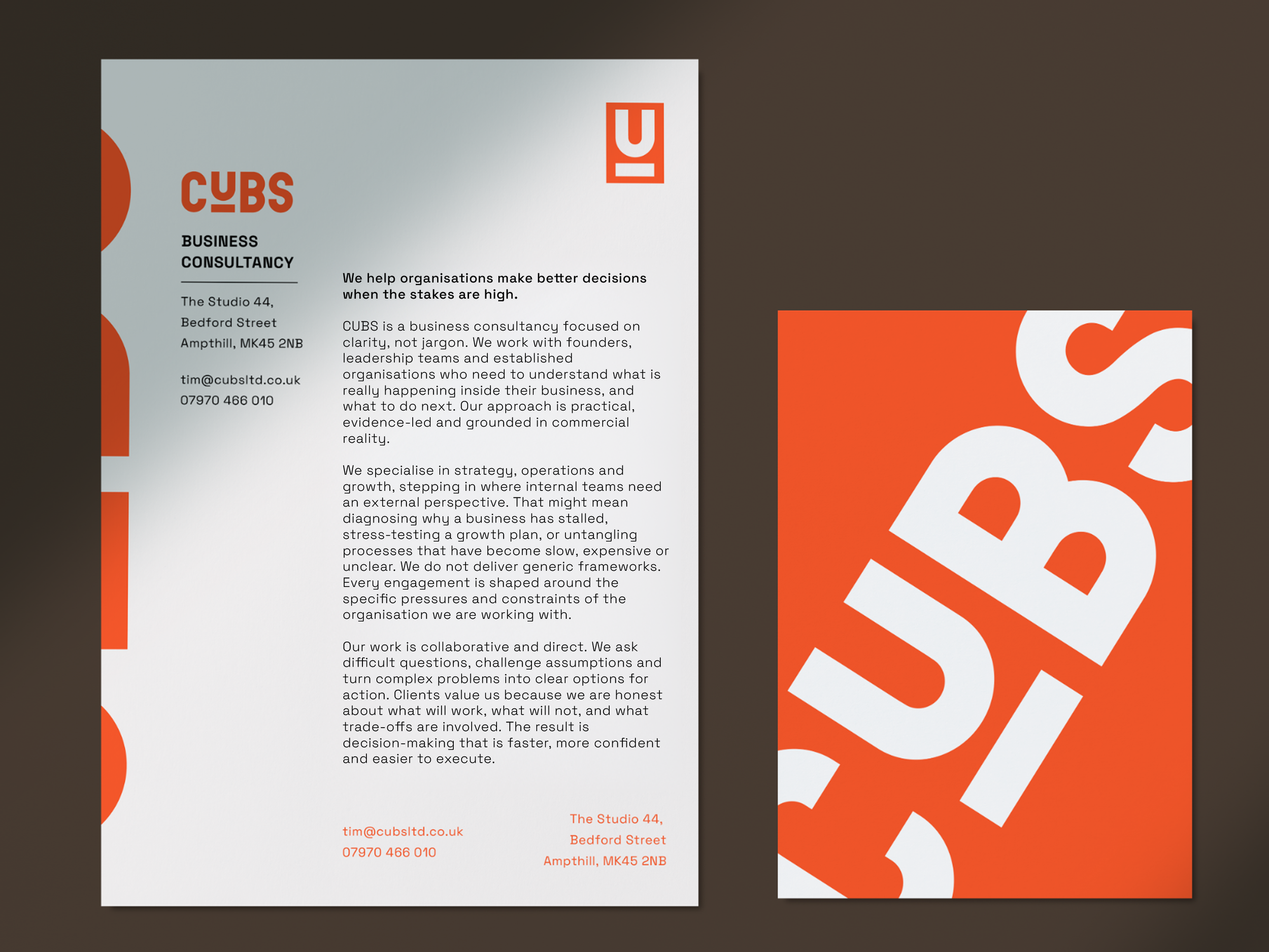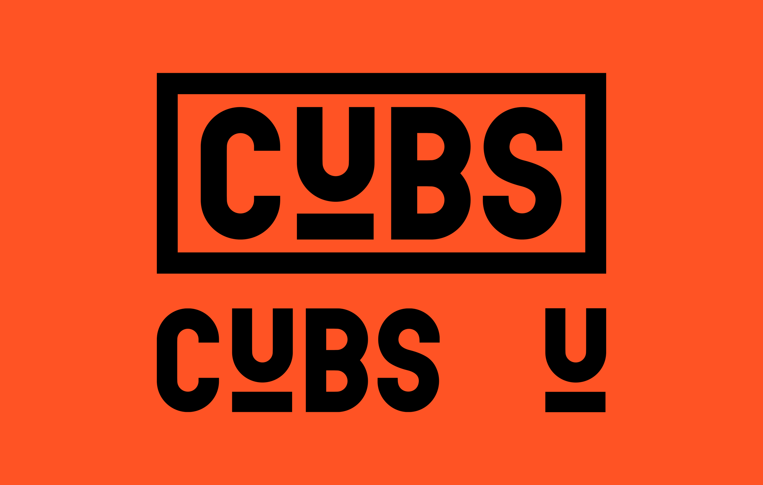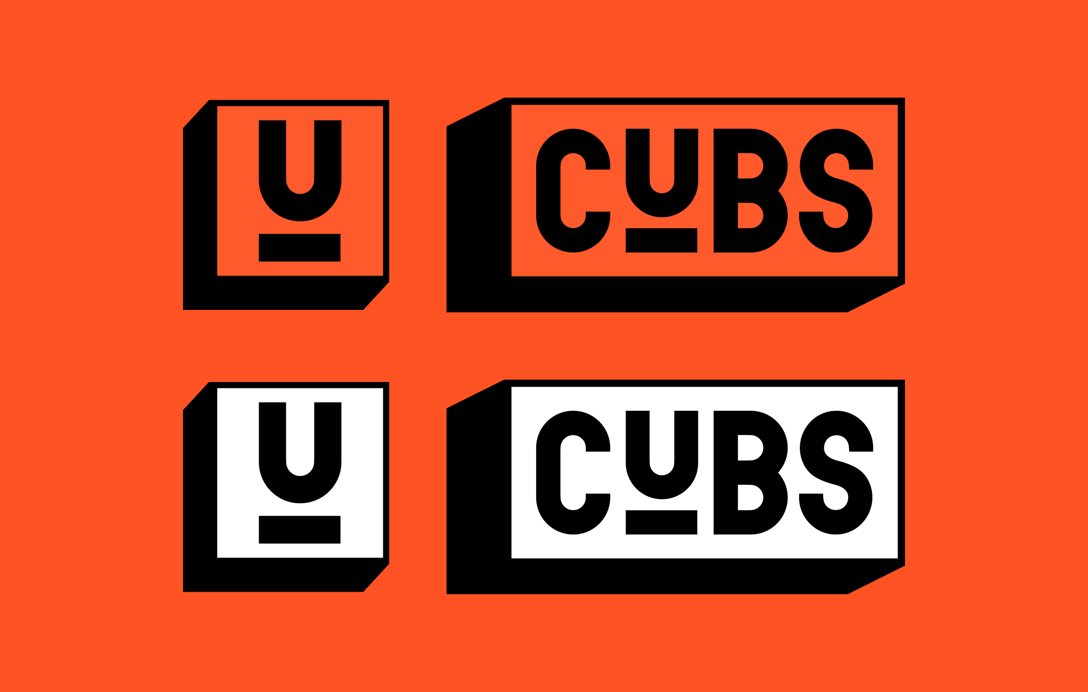
CUBS
Brand Identity, Website Design - 2024
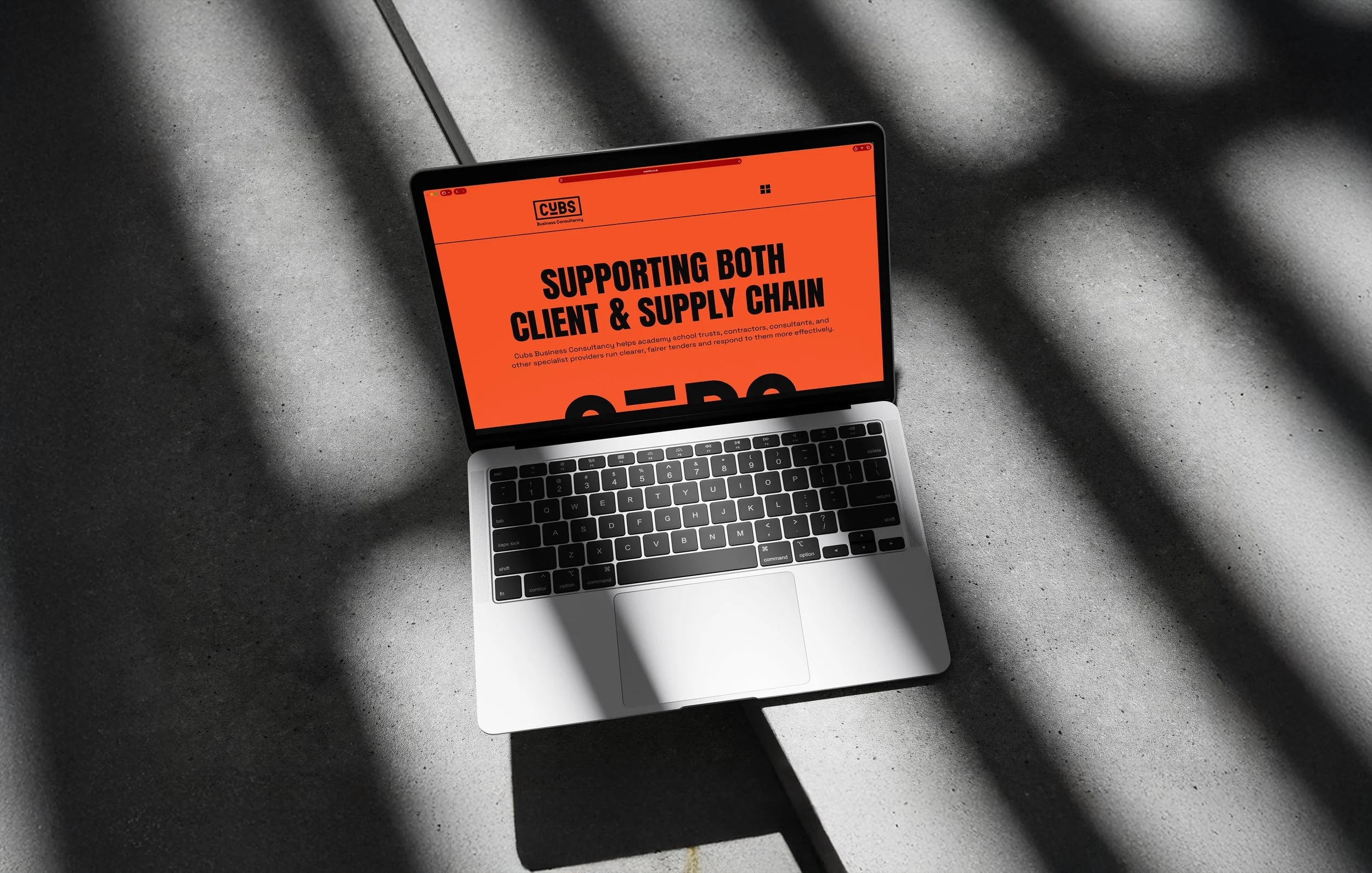
Identity and website for CUBS, a business consultancy working across procurement and tendering.
Consultancy branding tends toward the safe and forgettable. CUBS was designed to push against that - bold, high-contrast, and recognisable without undermining credibility. The underlined U places focus on the client and works as a standalone mark. The website was built with clear pathways for different audiences, keeping information-heavy content readable while still feeling like it belongs to a brand with some confidence.